Hardee's
8M+ impressions and 8,000 new followers with just one Tweet, thanks to social listening and spike alerts
Emplifi Webinars
Get the latest insights on social media marketing, social commerce, live commerce, and CX, straight from the experts.
Emplifi Blog
Get up to speed on the latest trends, tips, and best practices to power your CX strategy.
Community Corner
A space for our community to get the latest insights — directly from experts in the Emplifi community.


Don’t just take our word for it
Community management

Powerful analytics

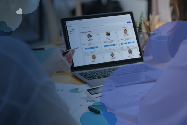
Influencer marketing

Customer ratings and reviews

User-generated content (UGC)

Live video shopping and care

Case management

Voice of the Customer (VoC)
Emplifi by the numbers
180%
increase in engagement rate on Instagram

20%
increase in online average order value (AOV)

40%
reduction in call center volumes


Book a personalized demo
See how Emplifi can help you drive more results on your social and digital channels.

Emplifi Reveals Instagram and TikTok Generated Highest Level of Organic Interactions for Brands in Latest Social Media Benchmarks Report


Emplifi Recognized Among Notable Vendors in Social Suite Landscape Report by Independent Research Firm
Emplifi releases product innovations for the holiday season; ahead of 2024 commerce technology assessments

Emplifi Social Commerce Cloud Helps Brands Make Social More Shoppable, Combining Social and Ecommerce Strategies To Drive Revenue